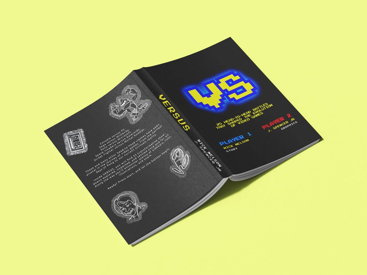
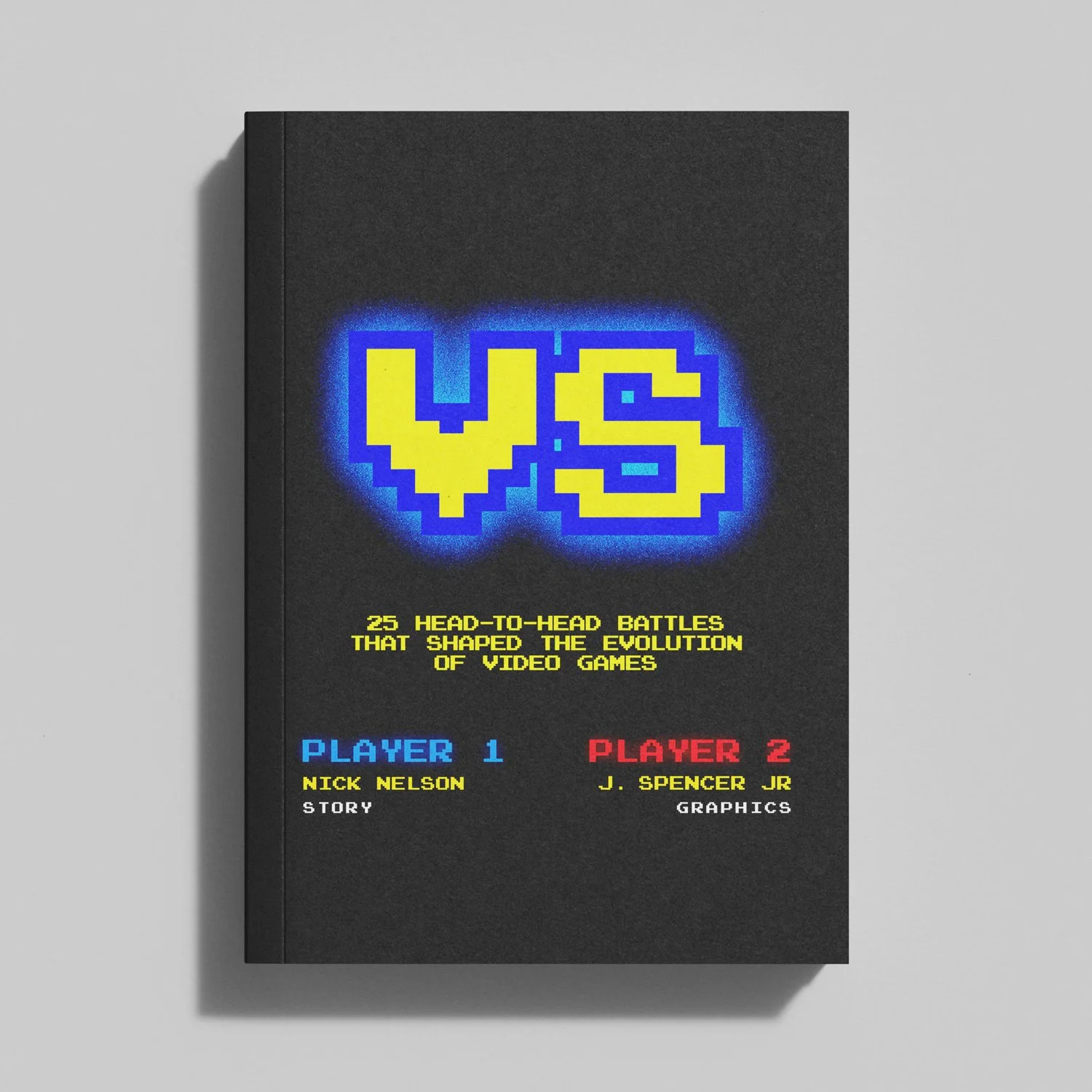
Versus book visual identity
Versus book visual identity
I’m an 80’s baby and I love video games. Especially fighting games. Shout out to my writing partner, Nick, who came to me with the idea to create a book about epic rivalries in the video game industry throughout the years. I was honored (and pumped) that he wanted me to design, layout, illustrate, and even write a bit.
The Process


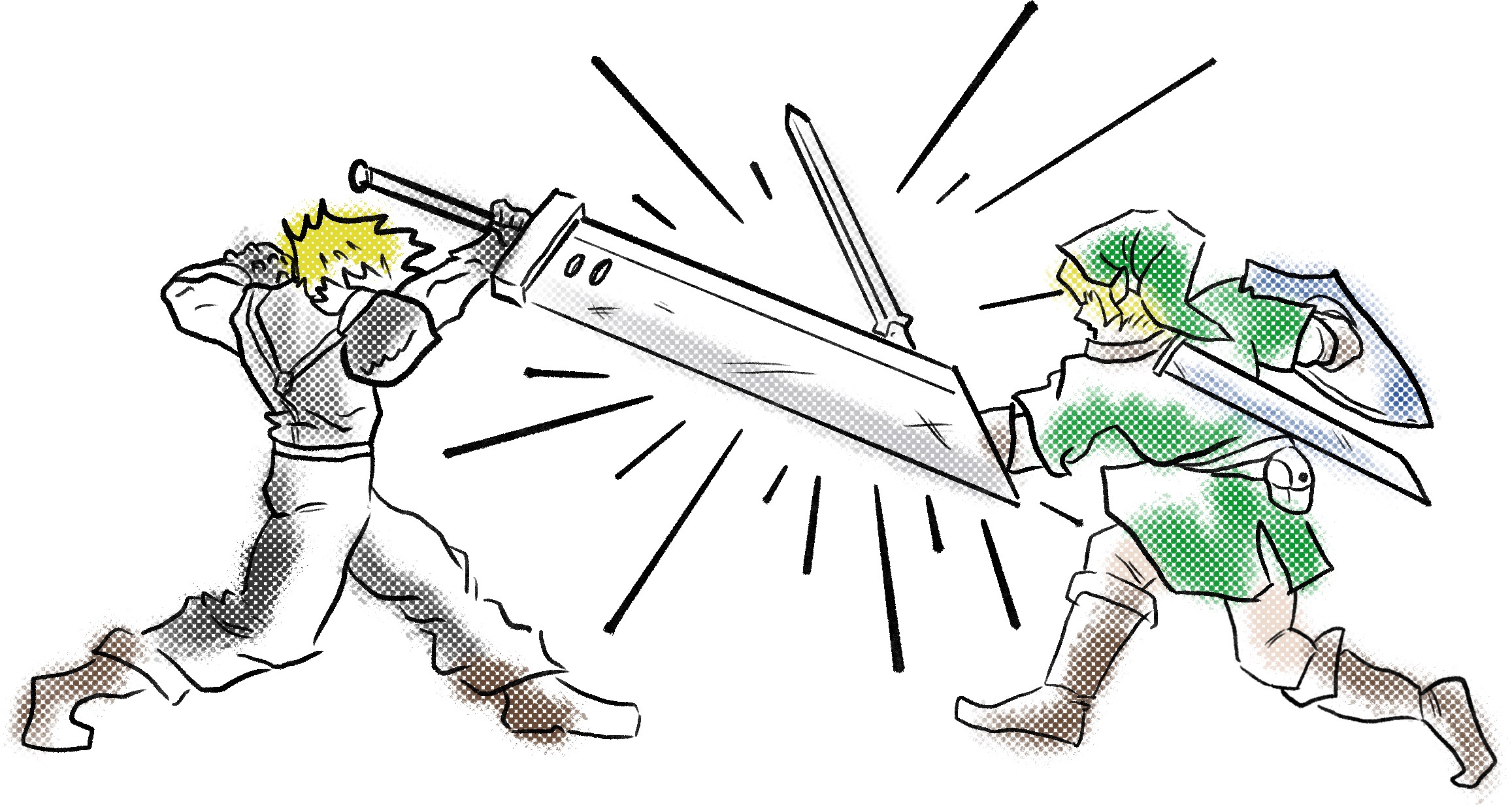
I wanted to encapsulate the feeling of walking into an arcade and seeing a crowd around a particular cabinet that you frequent, knowing that everyone there will be either a spectator, opponent, or both.

The winning design for the cover was a homage to Capcom, the company responsible for Street Fighter, Mega Man, and Marvel VS Capcom. I simplified it but made sure to maintain the pixel vibe.


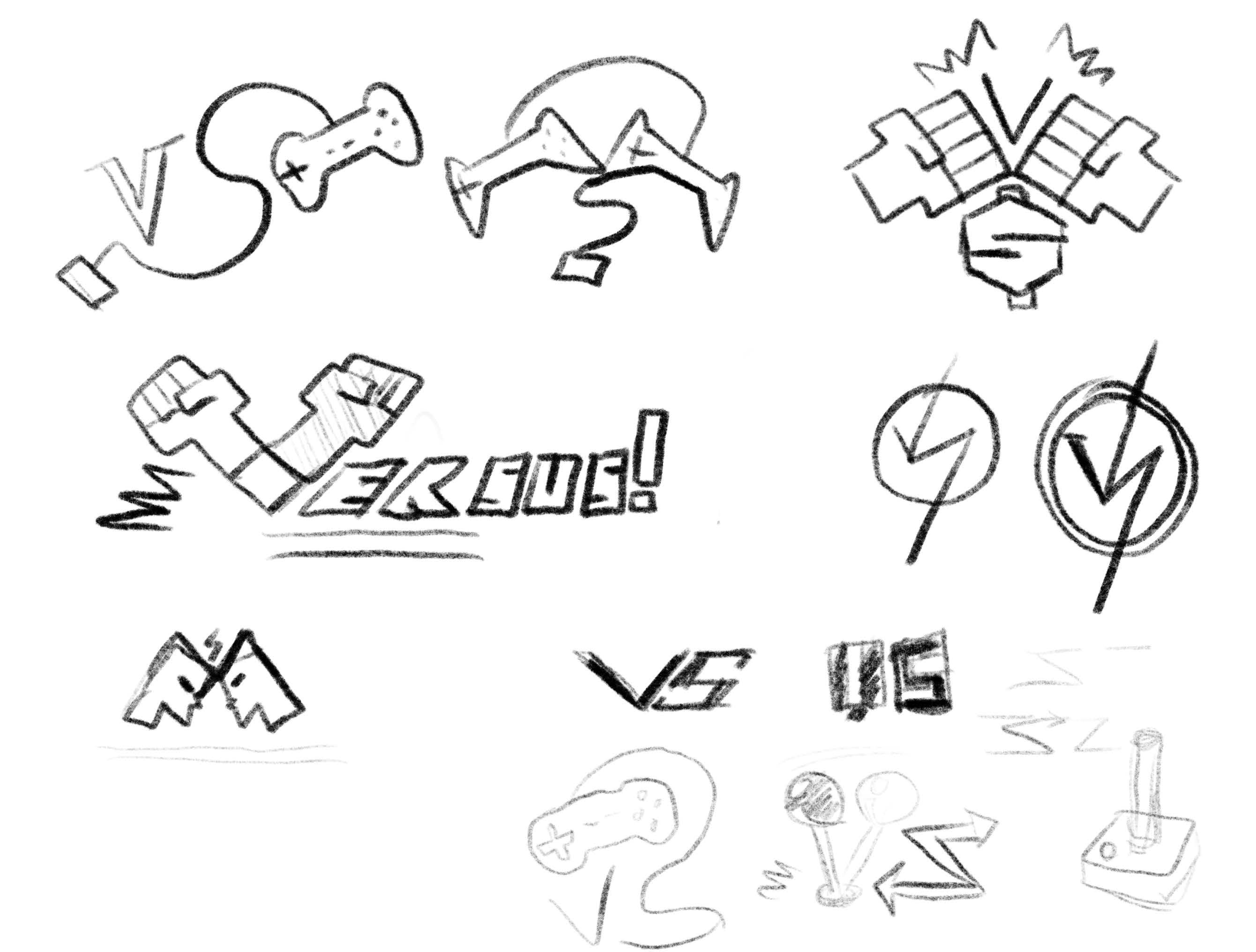
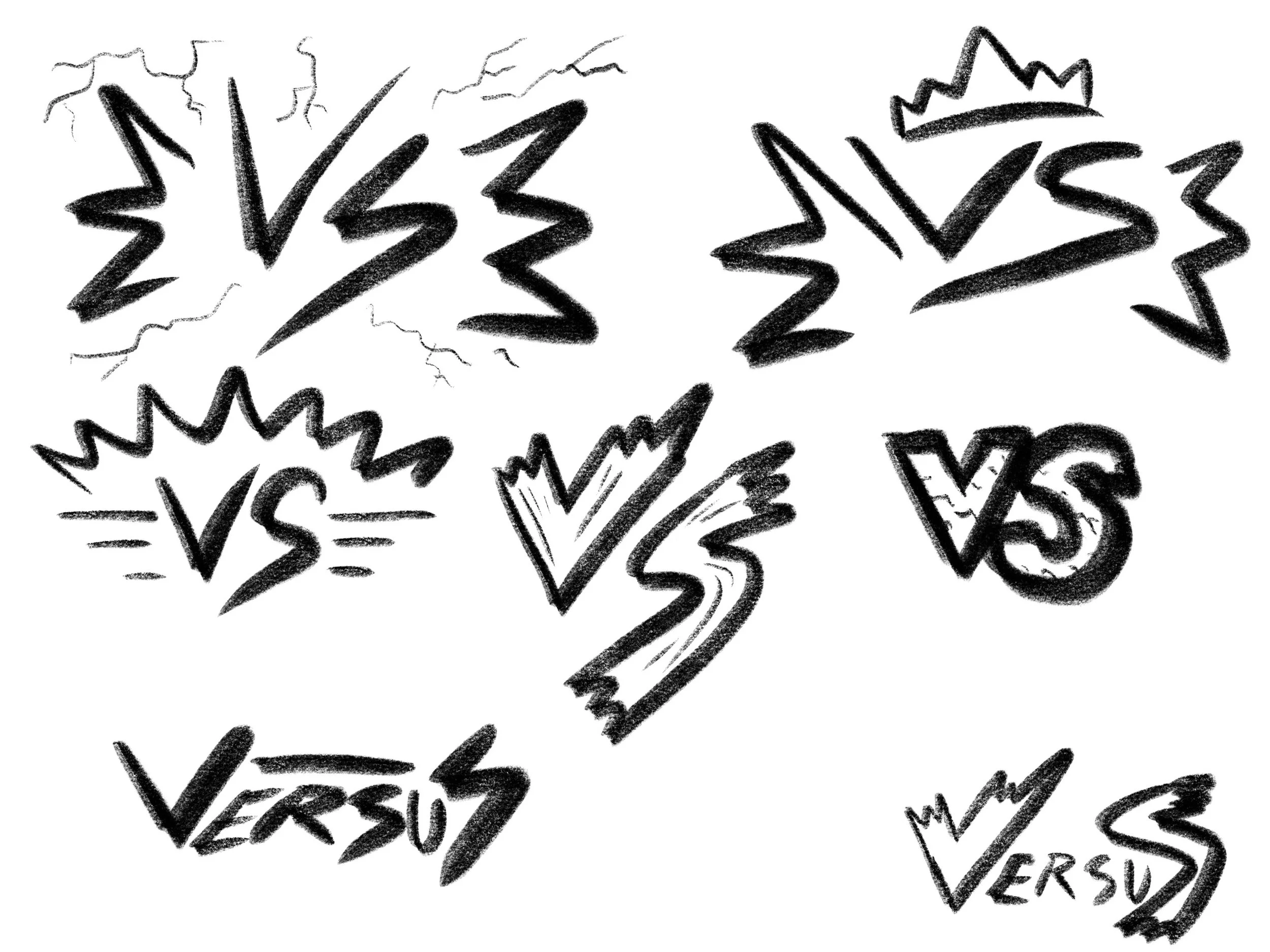
This is the final style I chose for the finished chapter pages.
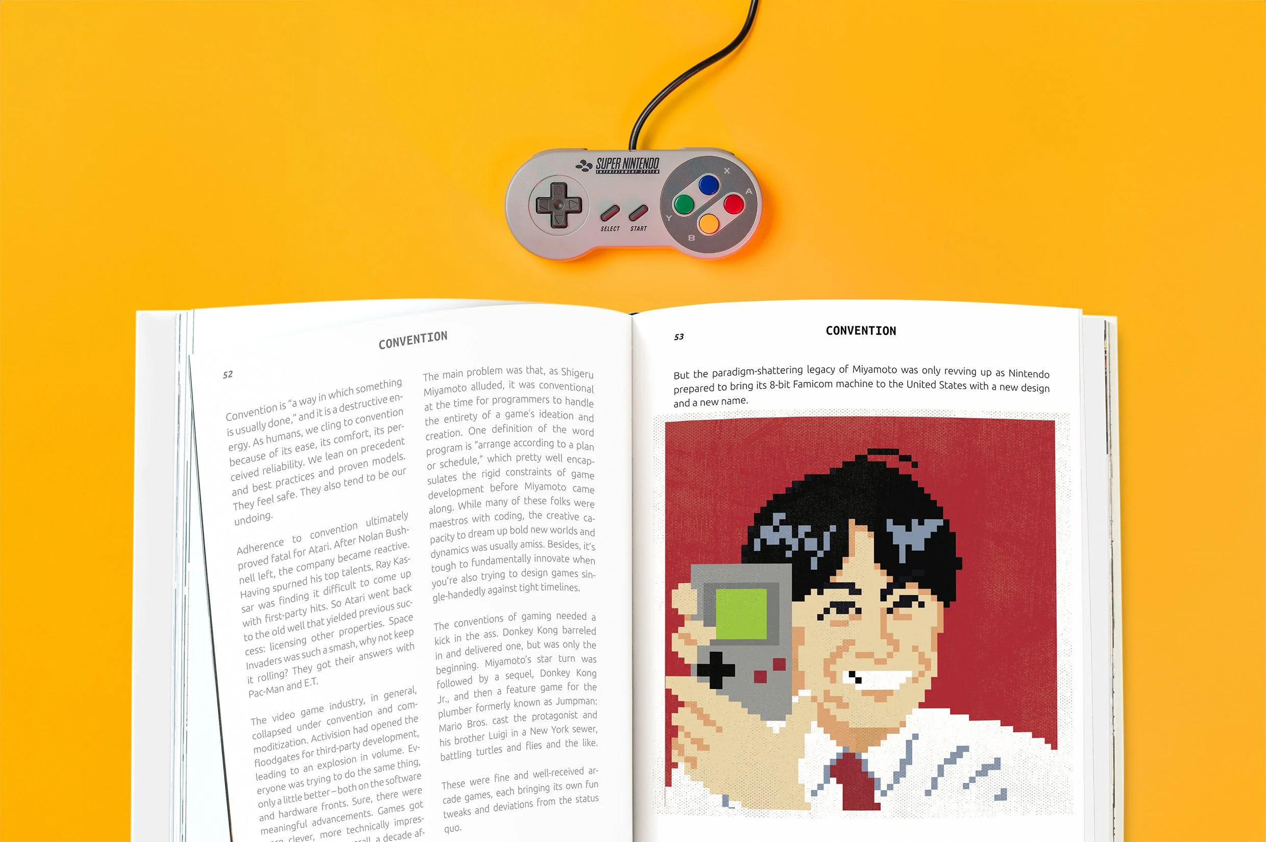
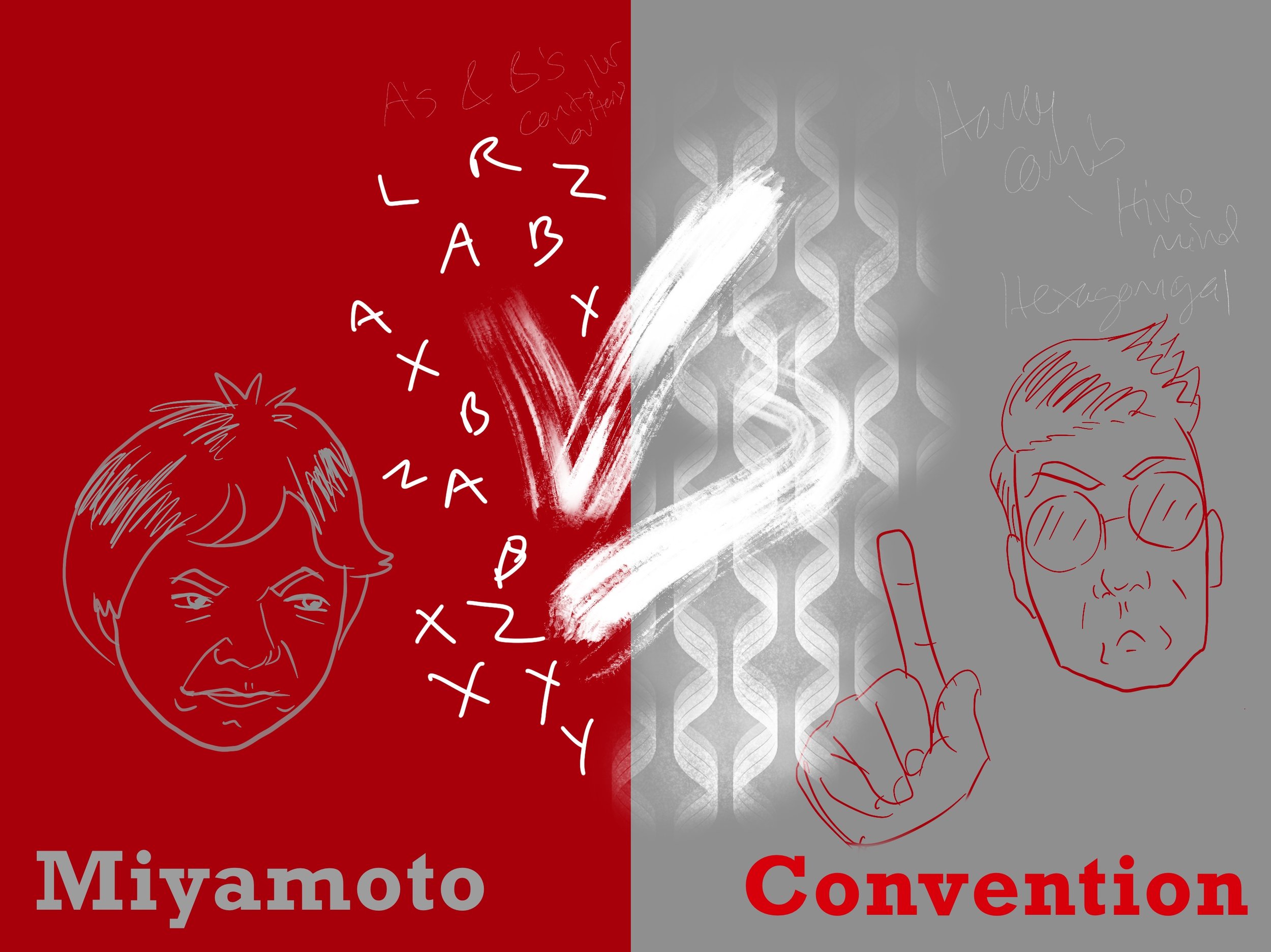
It’s a Miya…moto.
promo video
For the worldwide announcement, I put together a hype video to set the tone for what people could expect after they cracked open the book. I wanted to use chip-hop (8 bit video game style music) and sound effects from the retro gaming eras. This was a great exercise in using a few different video and motion graphic programs to achieve one cohesive piece.